Autodesk, Design System
Autodesk, Design System
Autodesk, Design System
Design Systems User Experience Design
Design Systems User Experience Design
Design Systems User Experience Design
Delivering a world-class UI toolkit, UX documentation, and icon library. Used by over 95 teams with 50k+ component inserts per week.
Delivering a world-class UI toolkit, UX documentation, and icon library. Used by over 95 teams with 50k+ component inserts per week.
Delivering a world-class UI toolkit, UX documentation, and icon library. Used by over 95 teams with 50k+ component inserts per week.

Context
I help design, maintain, and evolve the design system at Autodesk, which provides building blocks for web and digital experiences. My primary focus is to help other teams build faster while promoting consistency of components across our products, accessibility for all types of users, and brand alignment with the visual language at Autodesk. We support an estimated 2000 consumers of the system, who in turn enable 100M+ customers to properly interact with our suite of products and services.
UI Toolkit
A toolkit comprised of foundational elements, styles, tokens, and components.
We discovered that many of our key touch points throughout the customer journey were inconsistent without a comprehensive design system. As part our rebrand efforts, we began working on a revamped UI toolkit to enable teams to design at scale.

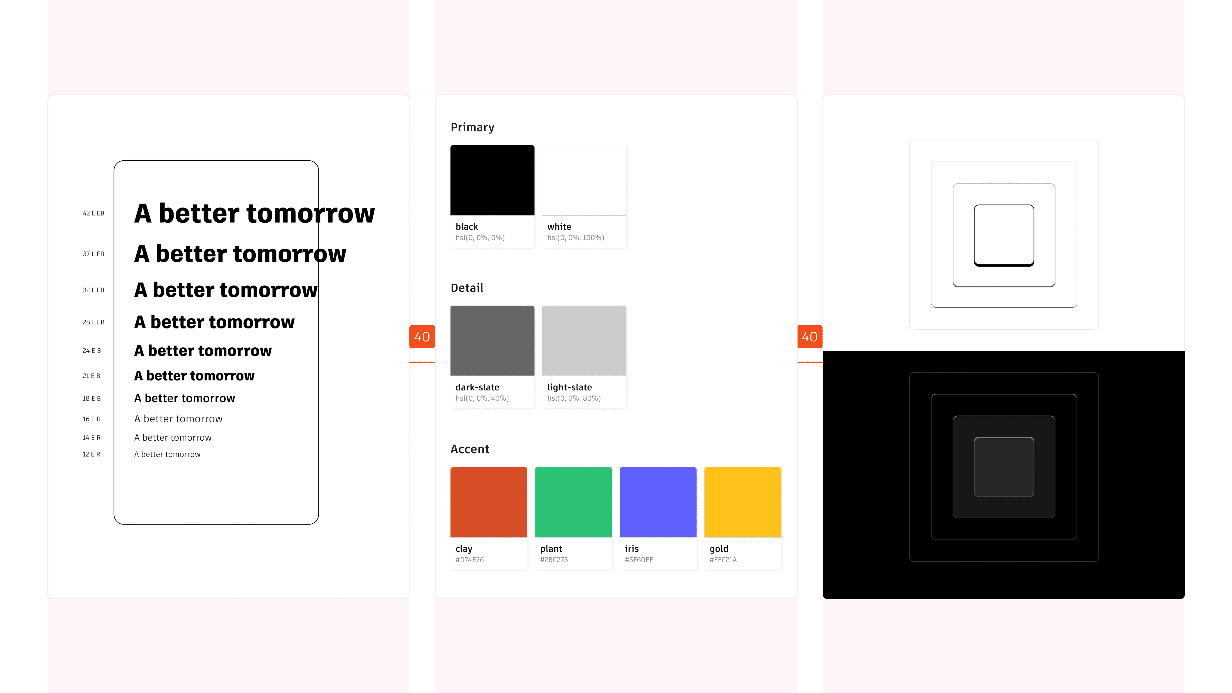
Foundational elements
Our foundational elements (e.g. responsive typography, global color primitives, spacing and elevation, and grid) form the basis for a consistent and cohesive visual language and provide a framework for a unified user interface.
Tokens, also referred to as variables, are the single source of truth to store and communicate a specific design decision. We integrate tokens directly into the UI toolkit, fostering a shared language between design and engineering.

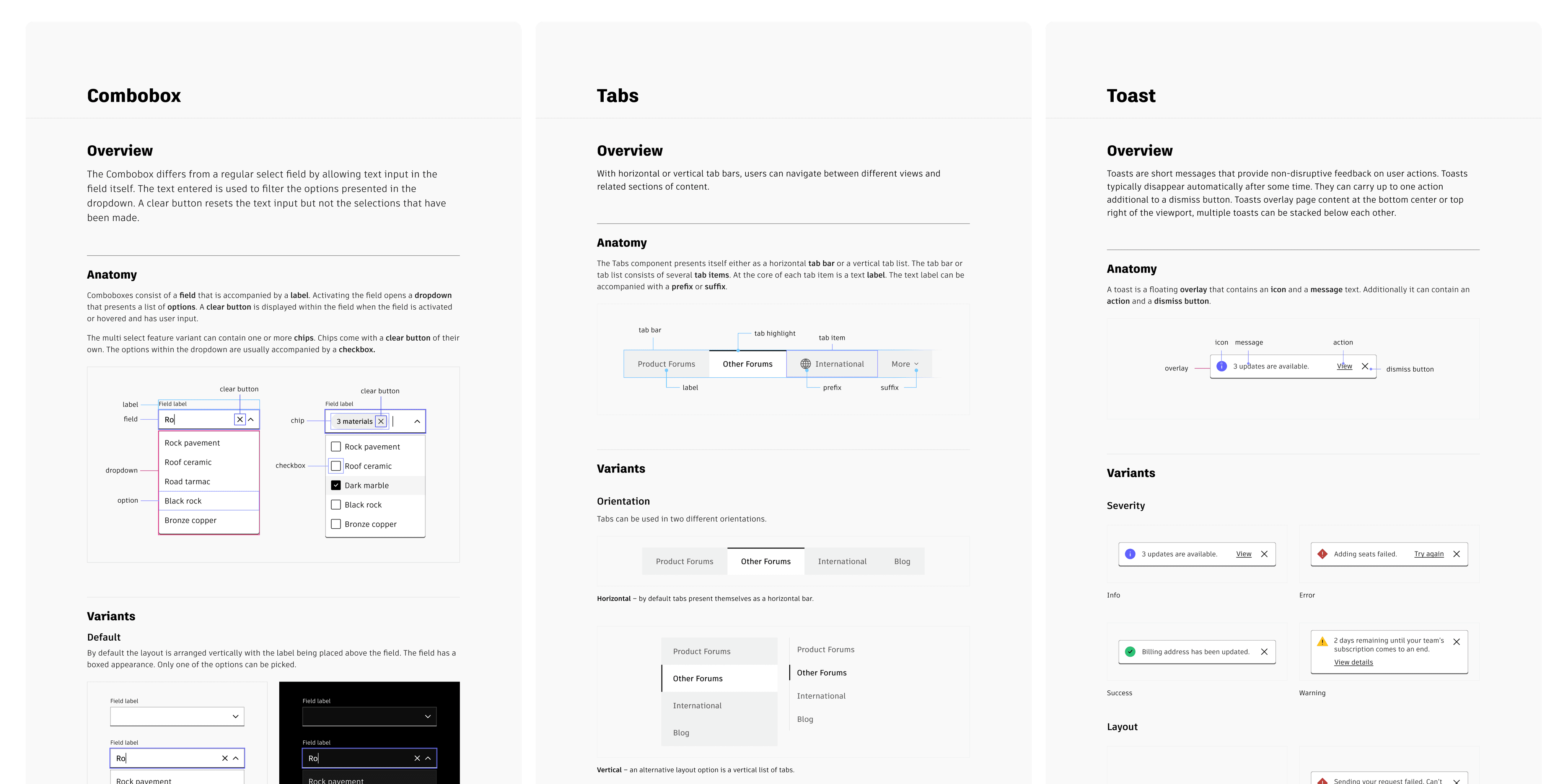
Components and themes
Components are reusable UI elements that can be used across different products and platforms. As of today, we have delivered over 45 components (and their variants) for designers to create with.
We also built light and dark mode themes so that consumers of the design system are able to switch between themed components easily within Figma. Prior to the introduction of the Figma variables feature we devised our own method using the community plugin: Atlas Theme Manager.

UX documentation
1.6k+ users registered on the UX documentation site.
A core part of a design system is in effective UX documentation, which define the standards and guidelines for components and elements. I help define and write these best practices, which are published on an internal website.

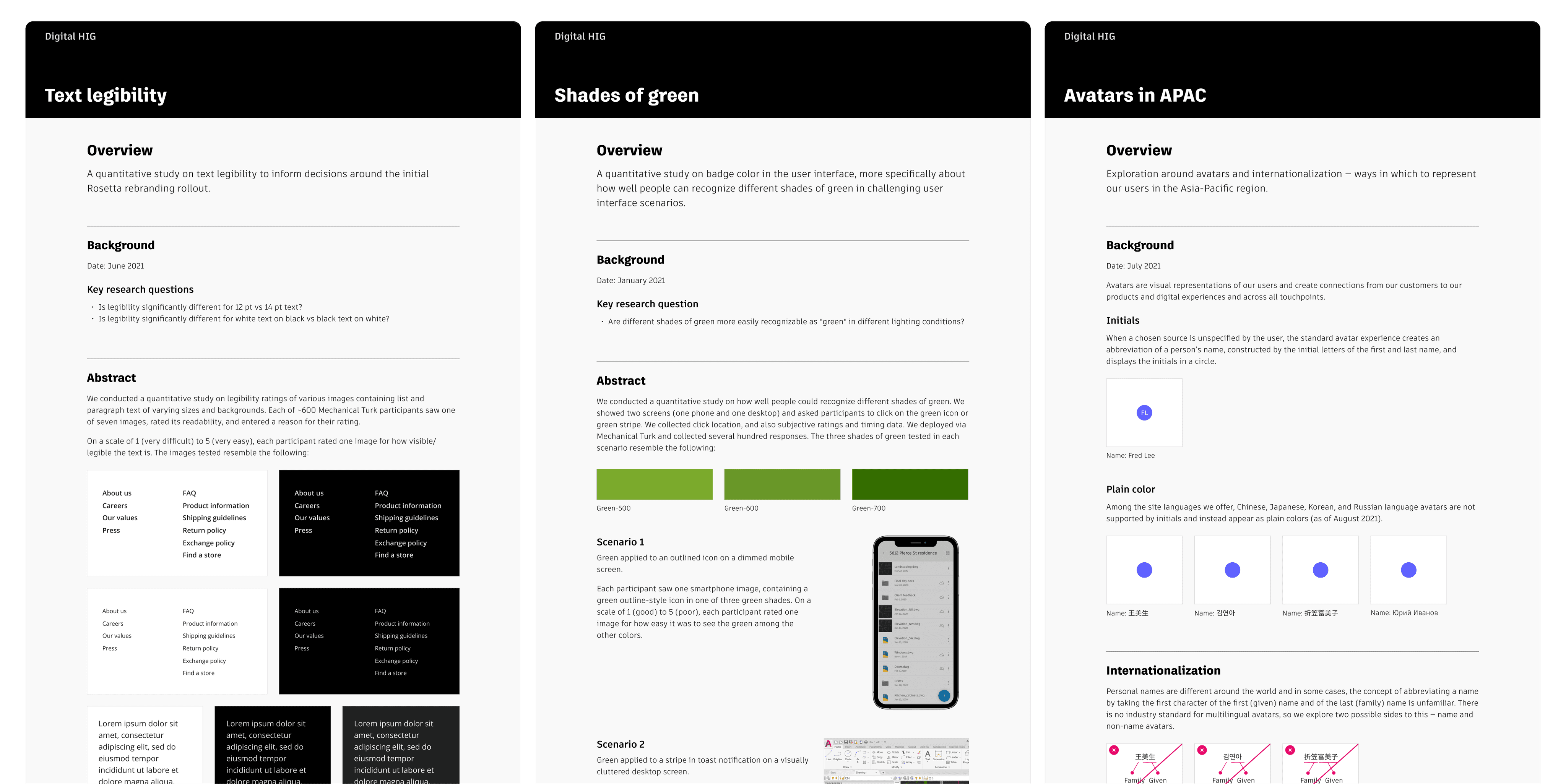
UX Research and discovery
Integrating UX research into our workflow validates design decisions and ensures that the design system meets the needs of our users. I worked with the UX research team to conduct various studies on inclusive design, including a study on how avatars are represented in APAC (internationalization) and a study on text legibility to inform decisions around the initial rebrand rollout.
Design and engineering parity

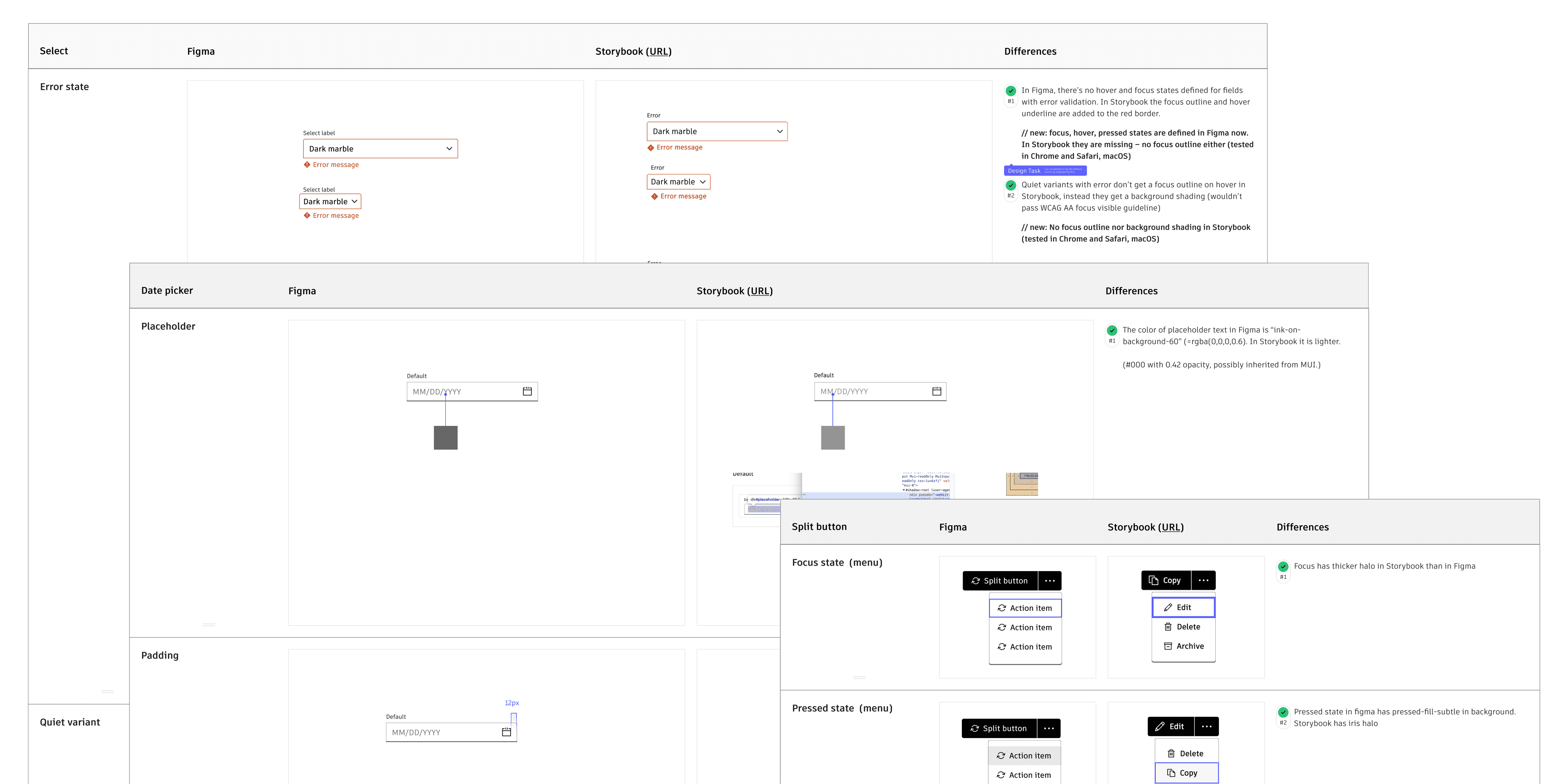
To reduce inconsistencies in web experiences, we set out to ensure that design system components are consistent and reliable for both designers and engineers to work with.
In order to ensure that working components aligned with our design system specs, we documented the disparity between our Figma designs and coded components (in Storybook), completed prioritization exercises to pare down features to a critical set that met the majority of consumer needs without impacting the quality of the user experience, and refined components to reach the desired parity.
Icon library
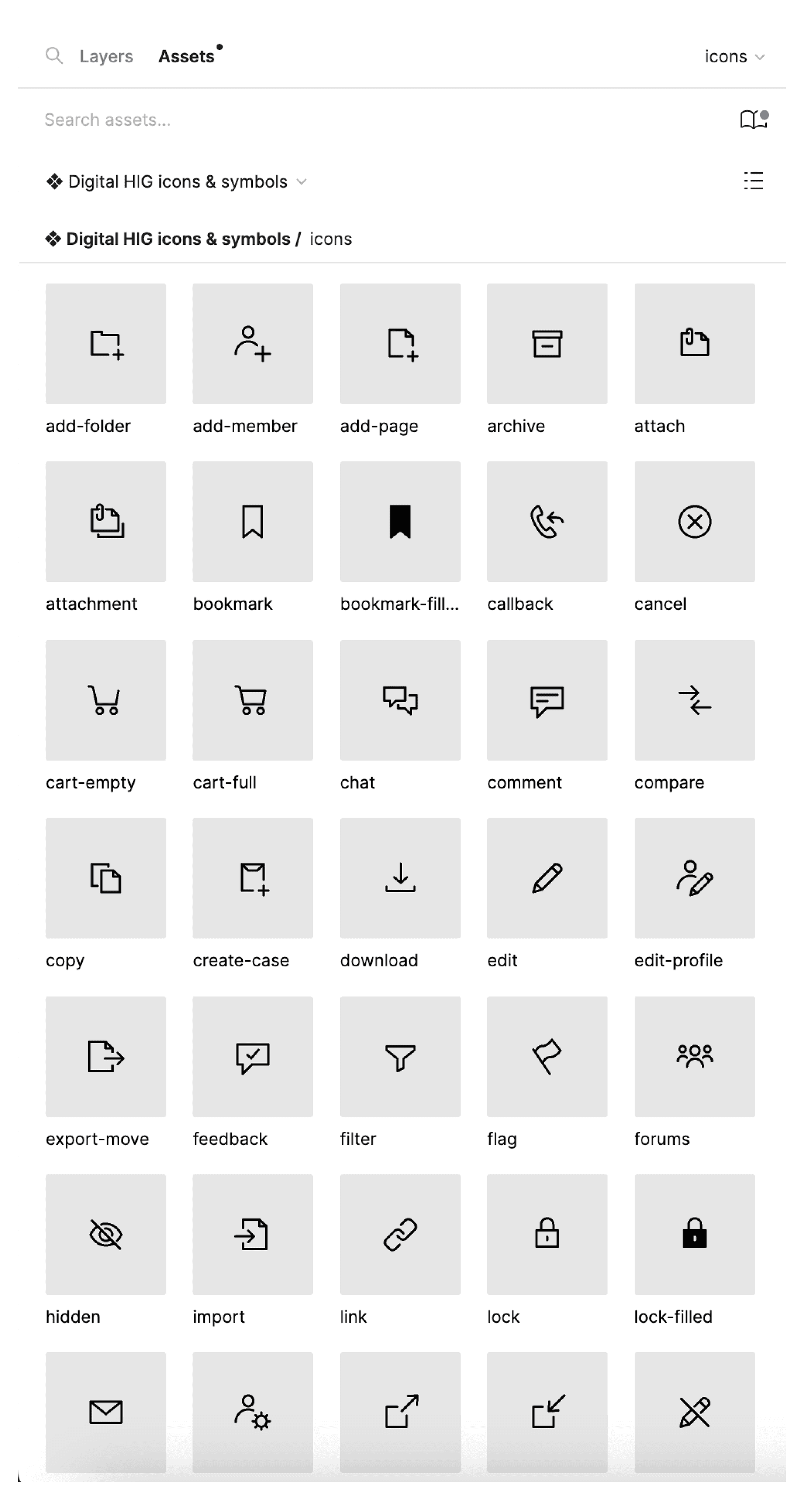
I helped create numerous icons that are available in our design system's icon library that has over 250+ icons, symbols, and UI controls for designers to use.
In use
Examples of the design system in use.
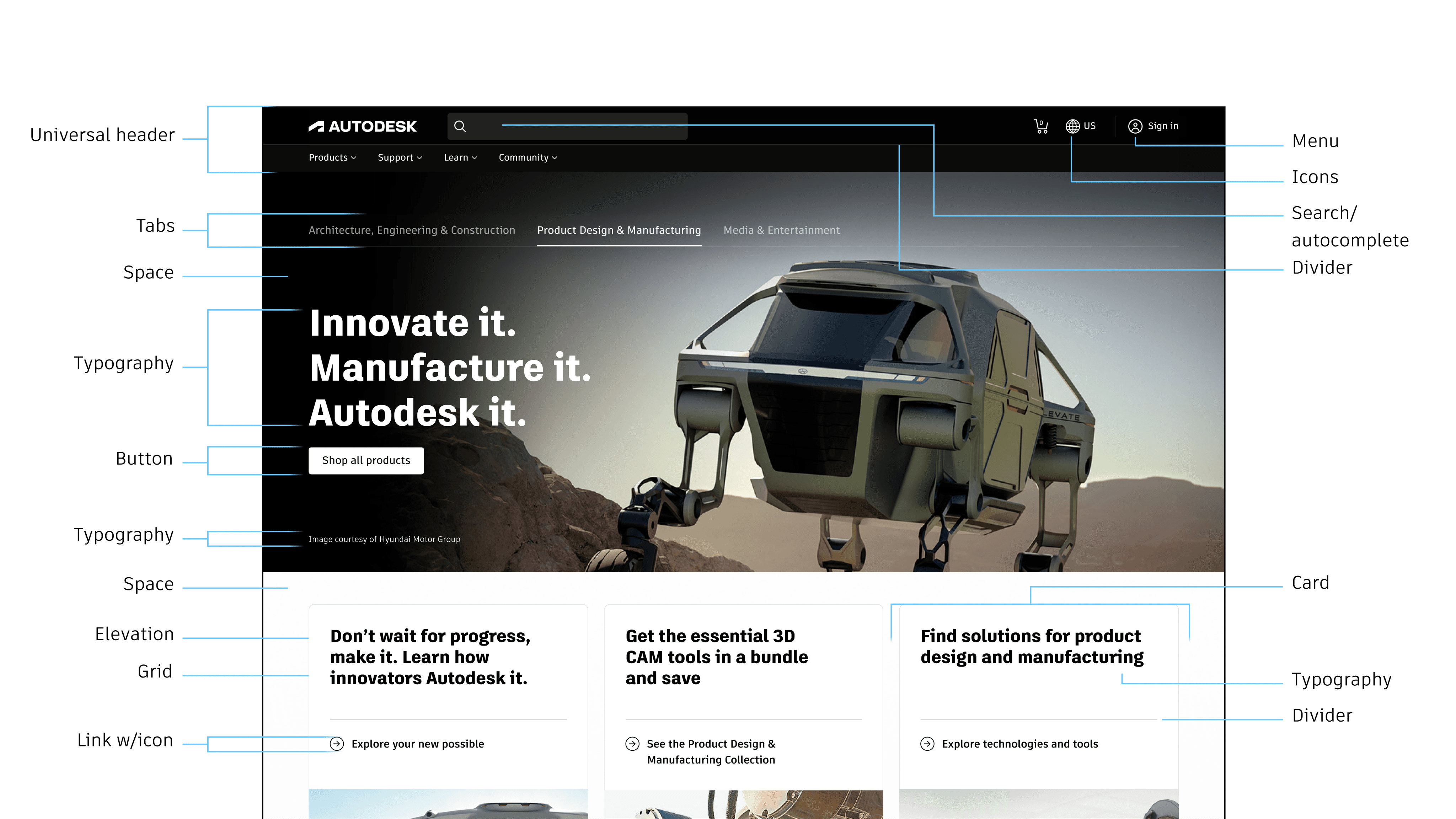
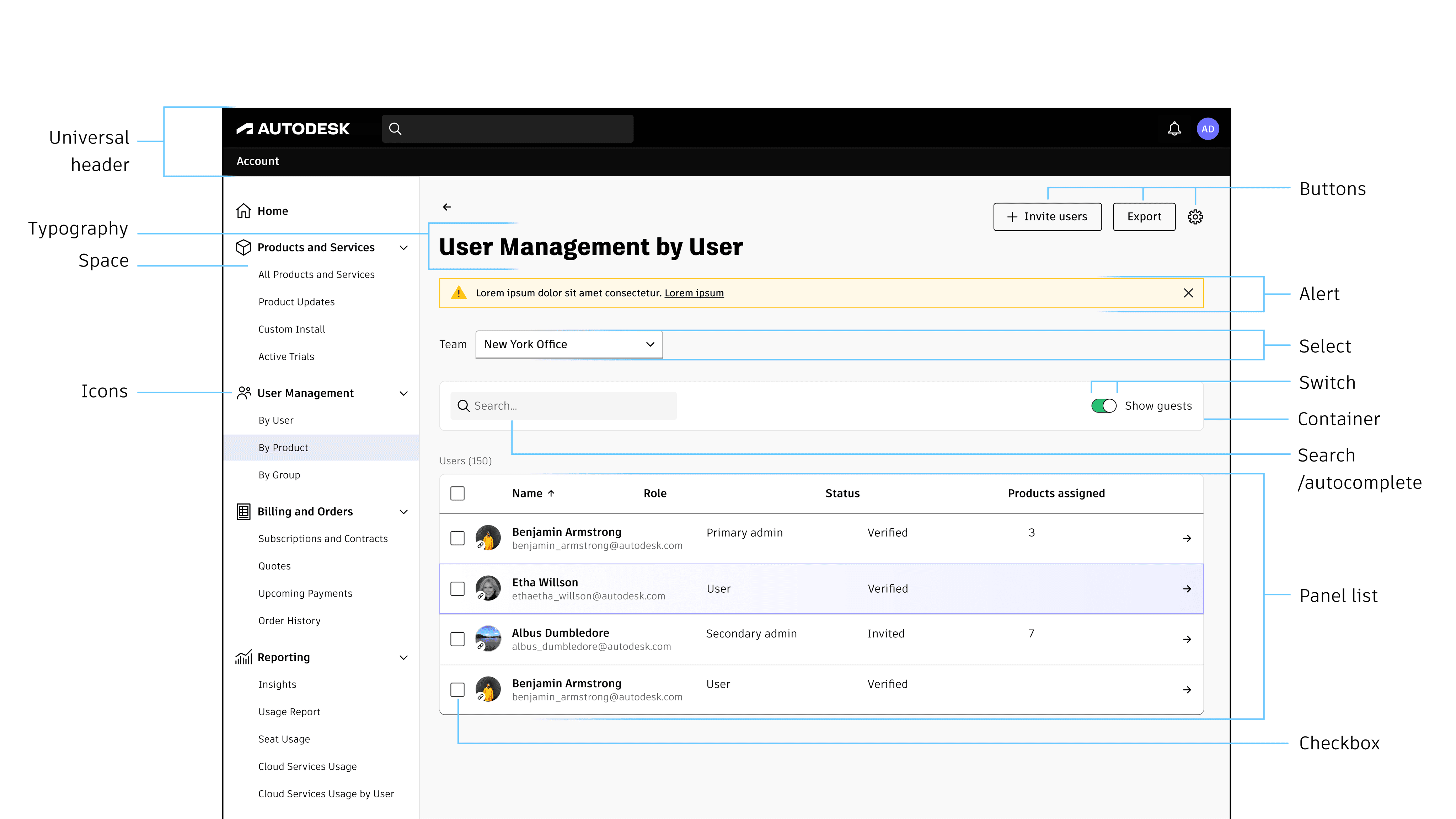
Components are designed to work well within different contexts, such as detail-rich, high-profile experiences like the homepage and dense, compact, task-driven account management dashboards.
© Margaret Ma 2024
Context
I help design, maintain, and evolve the design system at Autodesk, which provides building blocks for web and digital experiences. My primary focus is to help other teams build faster while promoting consistency of components across our products, accessibility for all types of users, and brand alignment with the visual language at Autodesk. We support an estimated 2000 consumers of the system, who in turn enable 100M+ customers to properly interact with our suite of products and services.
UI Toolkit
A toolkit comprised of foundational elements, styles, tokens, and components.
We discovered that many of our key touch points throughout the customer journey were inconsistent without a comprehensive design system. As part our rebrand efforts, we began working on a revamped UI toolkit to enable teams to design at scale.
Foundational elements
Our foundational elements (e.g. responsive typography, global color primitives, spacing and elevation, and grid) form the basis for a consistent and cohesive visual language and provide a framework for a unified user interface.
Tokens, also referred to as variables, are the single source of truth to store and communicate a specific design decision. We integrate tokens directly into the UI toolkit, fostering a shared language between design and engineering.
Components and themes
Components are reusable UI elements that can be used across different products and platforms. As of today, we have delivered over 45 components (and their variants) for designers to create with.
We also built light and dark mode themes so that consumers of the design system are able to switch between themed components easily within Figma. Prior to the introduction of the Figma variables feature we devised our own method using the community plugin: Atlas Theme Manager.
UX documentation
1.6k+ users registered on the UX documentation site.
A core part of a design system is in effective UX documentation, which define the standards and guidelines for components and elements. I help define and write these best practices, which are published on an internal website.
UX Research and discovery
Integrating UX research into our workflow validates design decisions and ensures that the design system meets the needs of our users. I worked with the UX research team to conduct various studies on inclusive design, including a study on how avatars are represented in APAC (internationalization) and a study on text legibility to inform decisions around the initial rebrand rollout.
Design and engineering parity
To reduce inconsistencies in web experiences, we set out to ensure that design system components are consistent and reliable for both designers and engineers to work with.
In order to ensure that working components aligned with our design system specs, we documented the disparity between our Figma designs and coded components (in Storybook), completed prioritization exercises to pare down features to a critical set that met the majority of consumer needs without impacting the quality of the user experience, and refined components to reach the desired parity.
Icon library
I helped create numerous icons that are available in our design system's icon library that has over 250+ icons, symbols, and UI controls for designers to use.
In use
Examples of the design system in use.
Components are designed to work well within different contexts, such as detail-rich, high-profile experiences like the homepage and dense, compact, task-driven account management dashboards.
© Margaret Ma 2024