Autodesk, Data Visualization
Autodesk, Data Visualization
Autodesk, Data Visualization
Design Systems, a11y User Experience Design
Design Systems, a11y User Experience Design
Design Systems, a11y User Experience Design
Accessibility features and color palettes for data visualization.
Accessibility features and color palettes for data visualization.
Accessibility features and color palettes for data visualization.

Context
At Autodesk, we noticed that existing data visualization elements lacked guidelines on color use which resulted in less cohesive and thus inaccessible experiences for our customer base. Working closely with our Insights, Brand, and Visual Design teams, I explored color conflicts and identified more accessible groupings as alternatives. I provided an updated best practices guide on color contrast requirements, use of white space, axes, and labels, and internationalization.
This work targets not only our existing customers, but also consumers of the design system such as the Insights team and the Help & Learn teams who are actively designing data visualization heavy experiences.
Problem
WCAG SC 1.4.1 Use of Color
SC 1.4.11 Non-text Contrast
SC 1.4.3 Text contrast
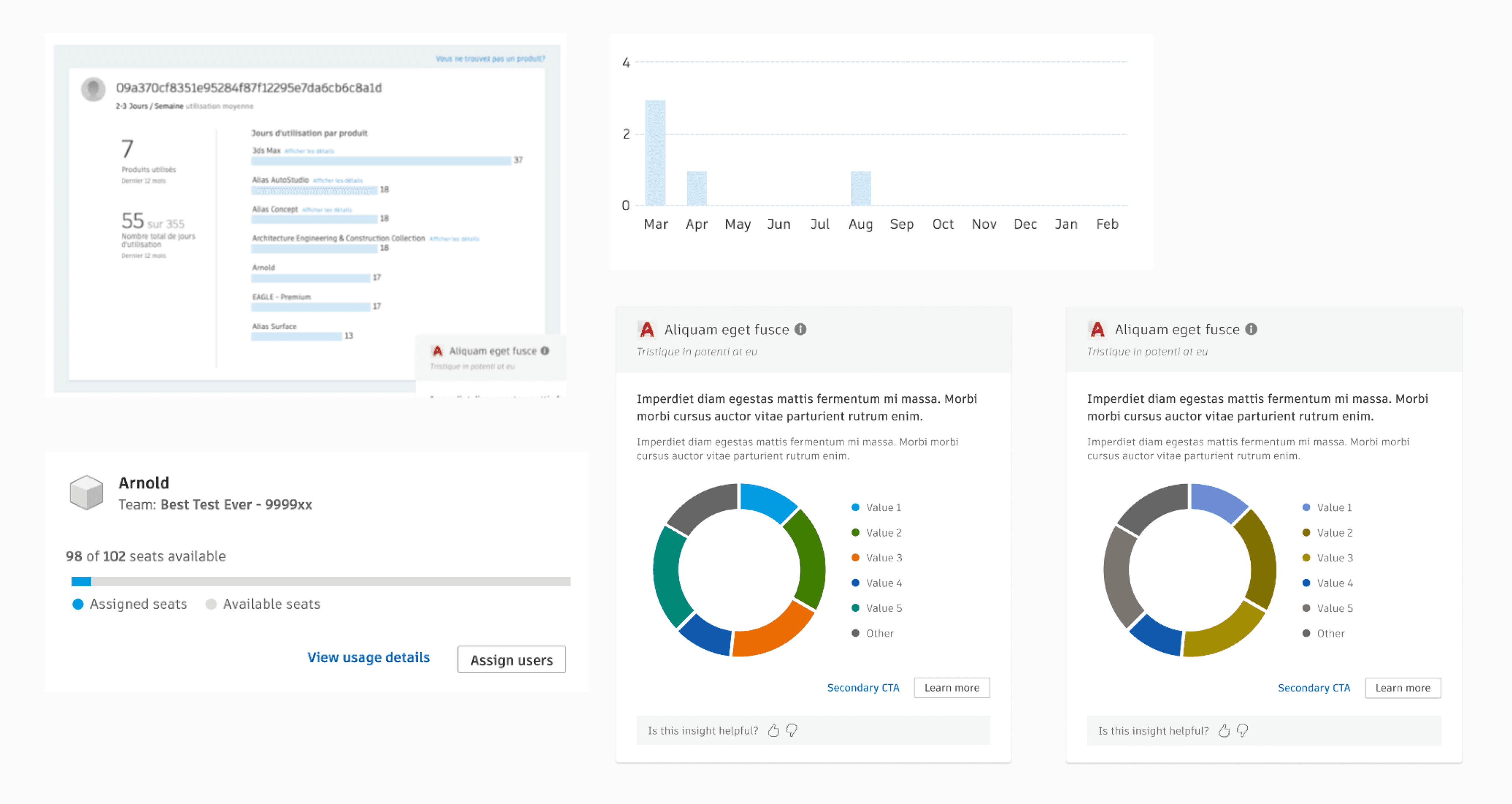
Prior to our rebrand, we noticed a number of low color contrast issues and color conflicts that made chart colors appear similar. To tackle this problem, we referenced the Web Content Accessibility Guidelines (WCAG) 2.1 success criterion for Non-text Contrast, Text Contrast, and Use of Color.
Non-text contrast
WCAG 2.1 SC 1.4.11 specifies that there must be a greater than 3:1 contrast ratio for non-text elements, including charts, when it is required for understanding. This requirement addresses low-vision users who would need to perceive chart elements for added comprehension.
This means, the color used for chart bars or slices would need to have a greater than 3:1 contrast ratio against a black or white background. I took every color used and tested it against our background colors to see if it complied with the contrast ratio requirement and noticed that a few colors did not.
Color conflicts
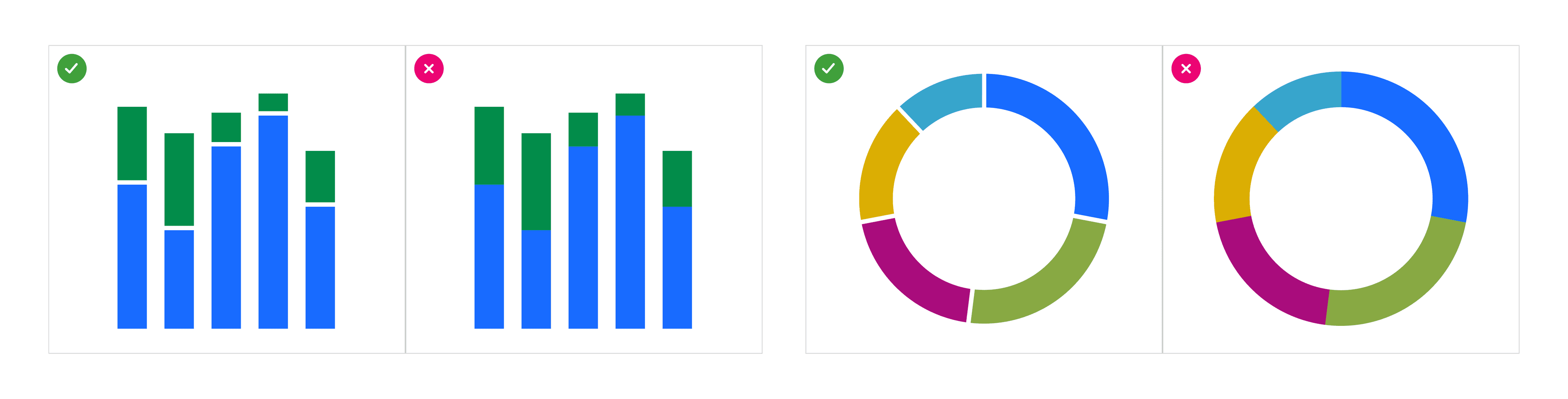
I simulated each color combination, the color against a white or black background and also against other data visualization colors, for different types of color blindness to evaluate whether the color combinations would affect users with color perception deficiencies.
I used an index that measures the differentiation of all the colors in a palette as a group, with all its permutations.
I conducted a number of iterations, adjusting the palette in various ways to reduce color conflicts while maximizing color contrast, and placed them in differing chart contexts to obtain feedback from the Brand team and ensure that the selected colors aligned across product branding.

Accessibility features
Adding whitespace between chart elements to maximize contrast.
An accessibility recommendation we included in our standards is for chart elements to include whitespace so that there is a deeper contrast between the chart element color and background color rather than the contrast between adjacent colors.
Improving text contrast.
Another success criterion is minimum contrast requirements for the visual presentation of text. With the new brand colors, across the board our text colors got darker and thus readability was improved. With colors that communicate alert, such as error text within charts, the text color provides an added visual cue to the user. In the design of the toolkit's foundational elements and thus seen within components, my team ensured that all text colors satisfy the 4.5:1 contrast requirement for text.
Limiting colors used using an alert palette to reduce visual complexity.
I recommended limiting the number of colors used in alert charts (e.g. the system notifying the user about over-assigned seats). In this example, instead of having 4 separate colors for the product badge, alert text, and 2 chart bar colors, we suggested reducing the number of visual features and color differences present with the use of black or white.

Creating color grouping options.
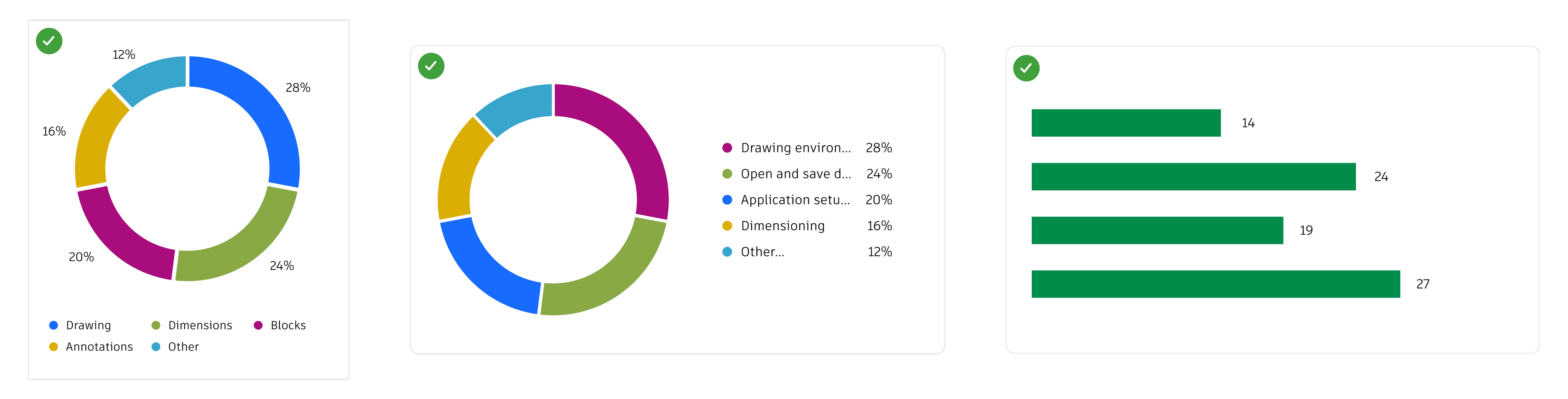
I created color grouping options for situations where there is a set number of data categories. The color sequence in these groups is curated to maximize contrast between adjacent colors (2:1 or greater contrast ratio) and minimize color conflicts so that the data categories are visually differentiable from one another.
For each group of colors, I compiled the color options and conducted voting exercises with a cross-functional working group consisting of ~20 internal representatives and subject matter experts.


The use of color and adding textual representation.
Another success criterion is to not solely rely on color to communicate information. I provided guidance on the use of data labels for added textual representation. If the colors and graphics alone do not comply with our set guidelines, the additional textual representation can make the chart more understandable.
Guidelines and examples
Data visualization UX guidelines are published on our internal documentation site.
Data visualization color palettes, usage, and accessibility features are published as guidance on our design system documentation site, bringing awarenesss to the in-depth explorations that my team does and our commitment to digital equity.

Next steps
Inclusion is ongoing.
Review the impacts of the new version of WCAG (3.0), which features a new method of evaluating color contrast called APCA.
Explore the structure and navigation of charts for screen readers.
Evaluate an "Export chart to data table" feature.
© Margaret Ma 2024
Context
At Autodesk, we noticed that existing data visualization elements lacked guidelines on color use which resulted in less cohesive and thus inaccessible experiences for our customer base. Working closely with our Insights, Brand, and Visual Design teams, I explored color conflicts and identified more accessible groupings as alternatives. I provided an updated best practices guide on color contrast requirements, use of white space, axes, and labels, and internationalization.
This work targets not only our existing customers, but also consumers of the design system such as the Insights team and the Help & Learn teams who are actively designing data visualization heavy experiences.
Problem
WCAG SC 1.4.1 Use of Color
SC 1.4.11 Non-text Contrast
SC 1.4.3 Text contrast
Prior to our rebrand, we noticed a number of low color contrast issues and color conflicts that made chart colors appear similar. To tackle this problem, we referenced the Web Content Accessibility Guidelines (WCAG) 2.1 success criterion for Non-text Contrast, Text Contrast, and Use of Color.
Non-text contrast
WCAG 2.1 SC 1.4.11 specifies that there must be a greater than 3:1 contrast ratio for non-text elements, including charts, when it is required for understanding. This requirement addresses low-vision users who would need to perceive chart elements for added comprehension.
This means, the color used for chart bars or slices would need to have a greater than 3:1 contrast ratio against a black or white background. I took every color used and tested it against our background colors to see if it complied with the contrast ratio requirement and noticed that a few colors did not.
Color conflicts
I simulated each color combination, the color against a white or black background and also against other data visualization colors, for different types of color blindness to evaluate whether the color combinations would affect users with color perception deficiencies.
I used an index that measures the differentiation of all the colors in a palette as a group, with all its permutations.
I conducted a number of iterations, adjusting the palette in various ways to reduce color conflicts while maximizing color contrast, and placed them in differing chart contexts to obtain feedback from the Brand team and ensure that the selected colors aligned across product branding.
Accessibility features
Adding whitespace between chart elements to maximize contrast.
An accessibility recommendation we included in our standards is for chart elements to include whitespace so that there is a deeper contrast between the chart element color and background color rather than the contrast between adjacent colors.
Improving text contrast.
Another success criterion is minimum contrast requirements for the visual presentation of text. With the new brand colors, across the board our text colors got darker and thus readability was improved. With colors that communicate alert, such as error text within charts, the text color provides an added visual cue to the user. In the design of the toolkit's foundational elements and thus seen within components, my team ensured that all text colors satisfy the 4.5:1 contrast requirement for text.
Limiting colors used using an alert palette to reduce visual complexity.
I recommended limiting the number of colors used in alert charts (e.g. the system notifying the user about over-assigned seats). In this example, instead of having 4 separate colors for the product badge, alert text, and 2 chart bar colors, we suggested reducing the number of visual features and color differences present with the use of black or white.
Creating color grouping options.
I created color grouping options for situations where there is a set number of data categories. The color sequence in these groups is curated to maximize contrast between adjacent colors (2:1 or greater contrast ratio) and minimize color conflicts so that the data categories are visually differentiable from one another.
For each group of colors, I compiled the color options and conducted voting exercises with a cross-functional working group consisting of ~20 internal representatives and subject matter experts.
The use of color and adding textual representation.
Another success criterion is to not solely rely on color to communicate information. I provided guidance on the use of data labels for added textual representation. If the colors and graphics alone do not comply with our set guidelines, the additional textual representation can make the chart more understandable.
Guidelines and examples
Data visualization UX guidelines are published on our internal documentation site.
Data visualization color palettes, usage, and accessibility features are published as guidance on our design system documentation site, bringing awarenesss to the in-depth explorations that my team does and our commitment to digital equity.
Next steps
Inclusion is ongoing.
Review the impacts of the new version of WCAG (3.0), which features a new method of evaluating color contrast called APCA.
Explore the structure and navigation of charts for screen readers.
Evaluate an "Export chart to data table" feature.
© Margaret Ma 2024